Pole Fitness World
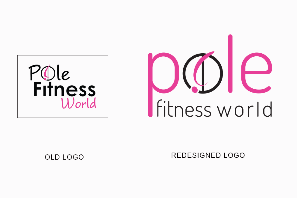
Pole Fitness World wanted their logo revamped, without moving too far away from their existing look.The new logo was to be: softer, more feminine, but keeping the figure in the circle and the same colours.
To help soften the overall look, the figure was made curvier, with a more gentle shape. The motion of the curve makes it feel more feminine, sexy and graceful. The new font and the lowercase text also contribute to the softer look, making it clean and more delicate.
The new logo is simple and strong, and importantly, both the figure and text remaining clear and recognisable when used at a small size.
